The Magic of Intersection

A gif animation of the brochure panels.
I’ve known photographer Rebecca Drobis for over 10 years, but it wasn’t until we took a pandemic walk that we came up with a way to tap into the power of collaboration.
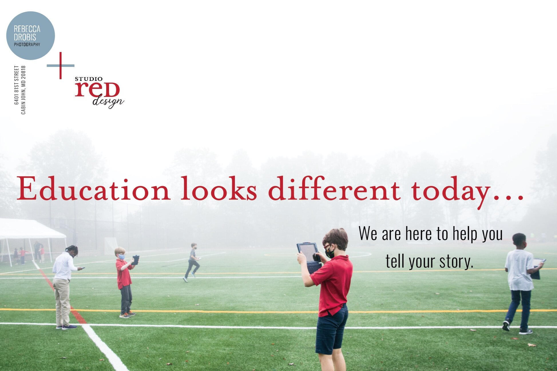
We both work with schools, but we have different skills. She takes stunning photographs; I create meaningful brochures, magazines and reports. She is pro-active about seeking new clients; I have relied on referrals. We decided to join forces — designing a self-mailer promoting us both, creating a piece titled “Education looks very different today...”

Symbol of our combined skills to create a “plus” for our clients.
The closed gate fold brochure I came up with showcases both Rebecca’s gorgeous photography and Studio Red’s print design and writing skills. Both of our businesses are symbolically brought together in the color-coded plus sign: the horizontal blue line calls up the color of Rebecca’s logo and her work with the landscape of schools, while the vertical red line symbolizes Studio Red’s way of drilling into clients’ goals and translating them into strong visual communications.
The mailer has been an exciting kick-off piece to our studio’s new branding and the strategy angle that our new CFO is bringing in 2021. But more than anything this project has shown me the opportunity partnership can create, and how important it is — especially during this period of isolation — to stay connected and cultivate the synergy of supportive relationships.
What’s your plus?

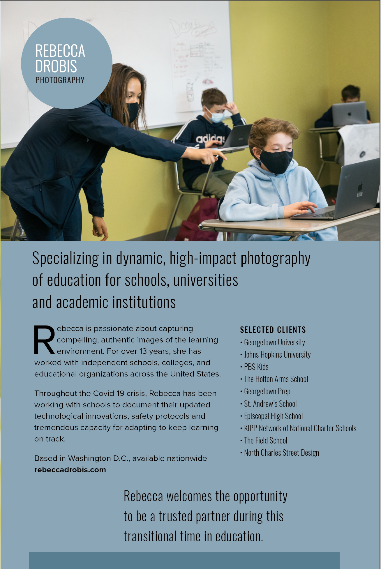
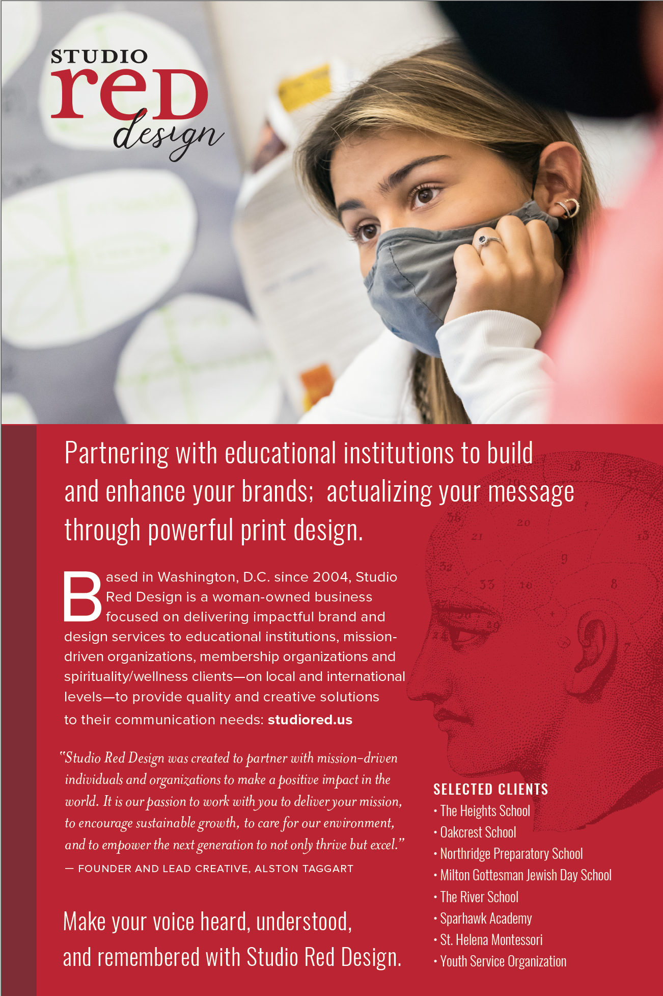
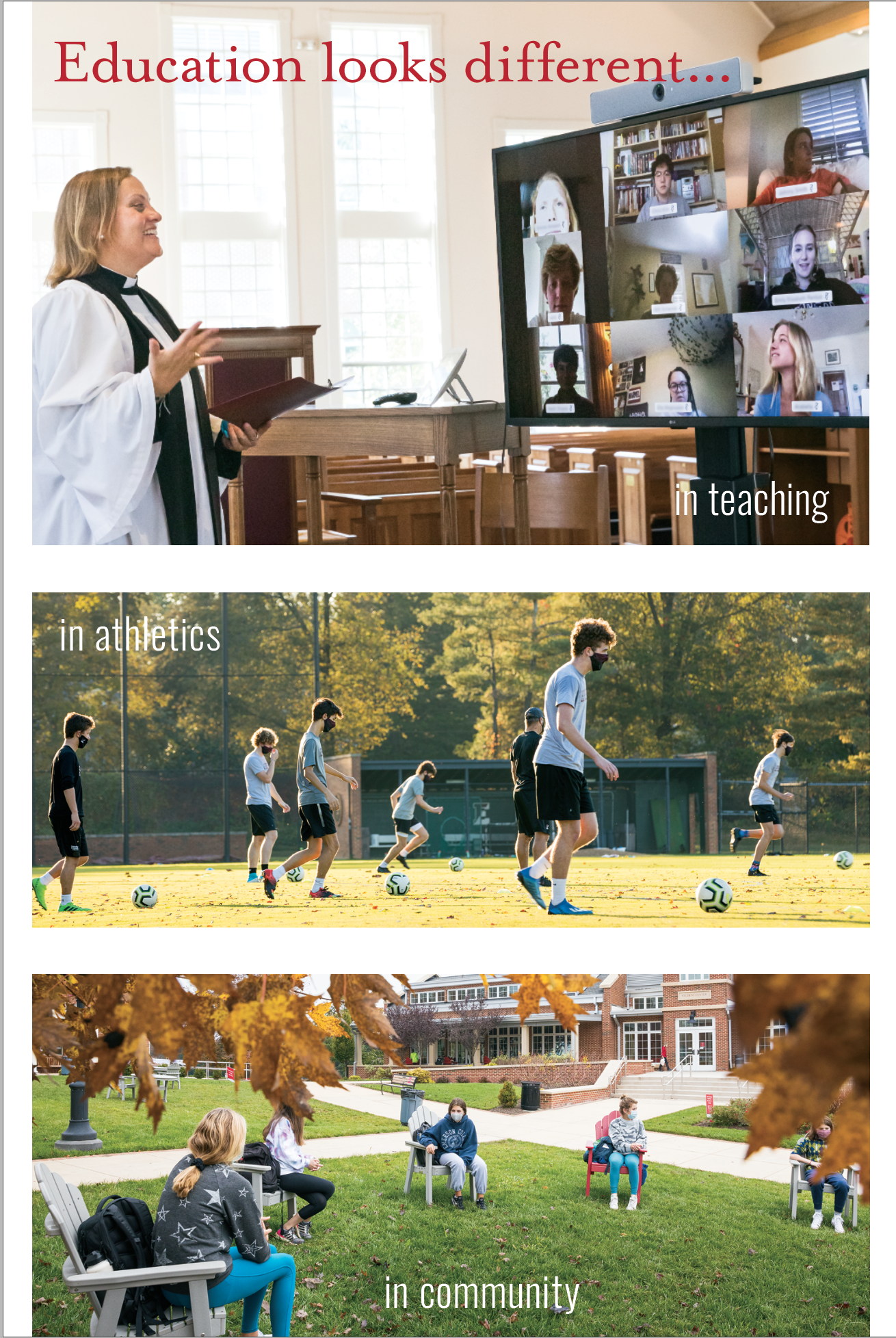
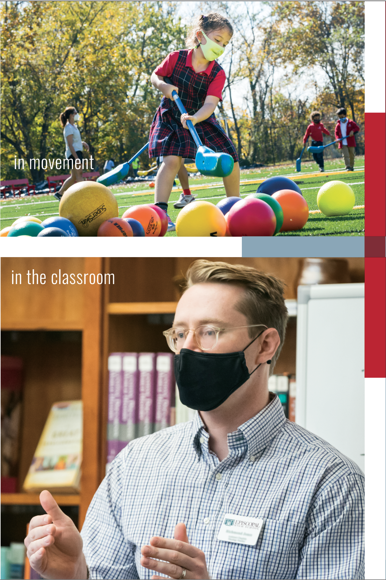
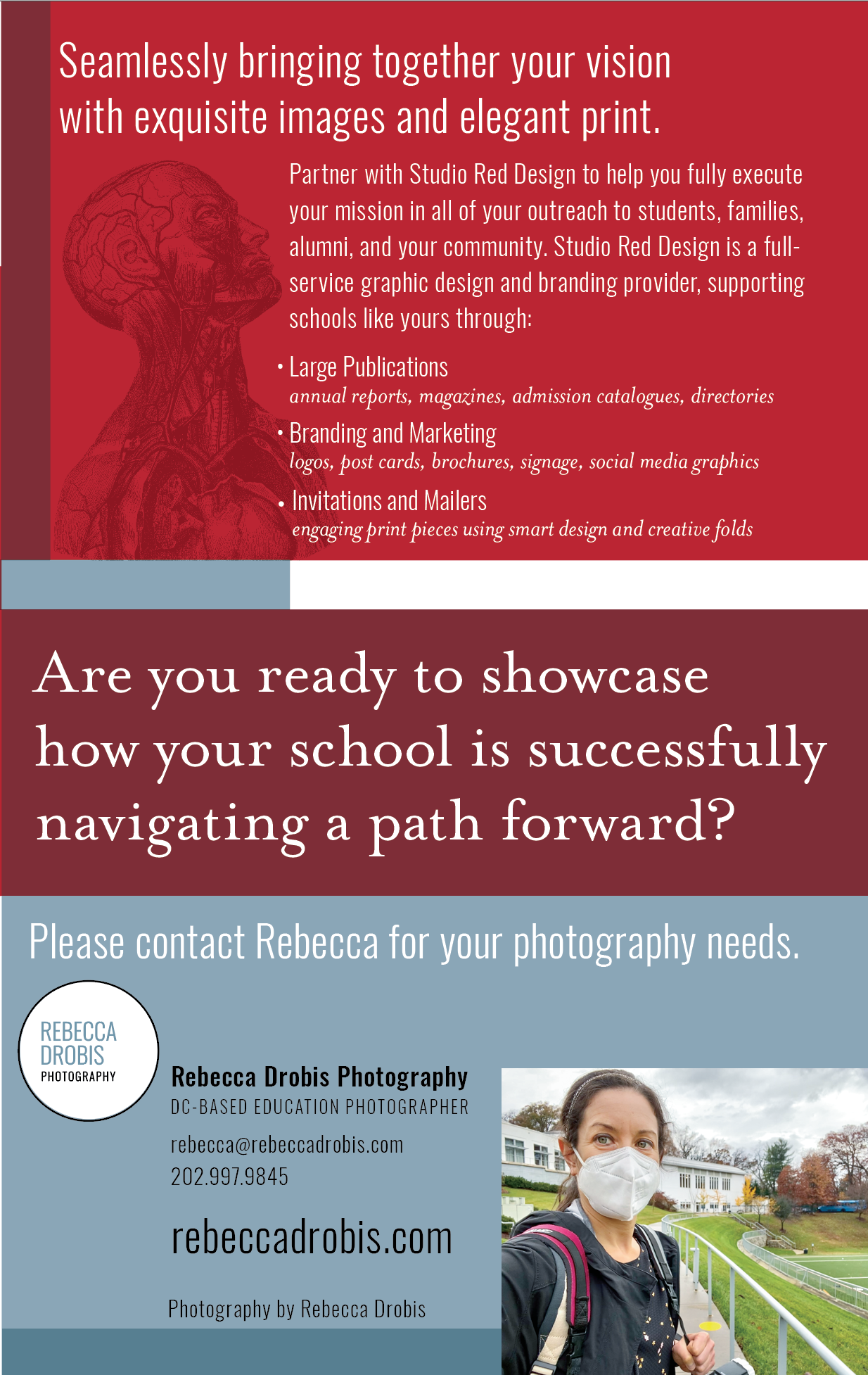
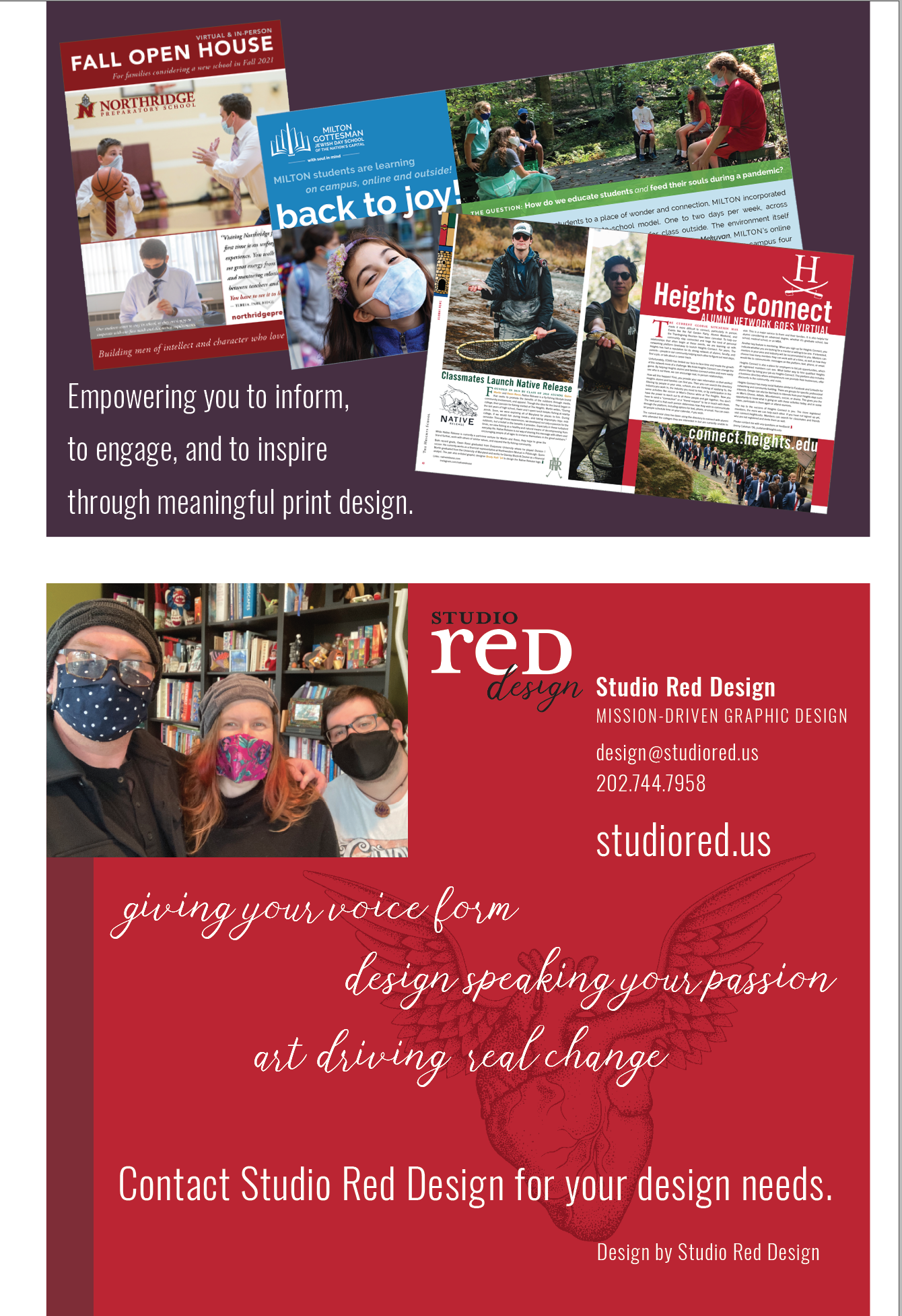
Panels from the closed gate fold educational self-mailer