Judging a Book by its Cover
Hey friends, this is Theron, Client Delight Lead and CFO here at Studio Red Design. Alston and Kevin are busy as elves in Santa’s workshop so I thought I would pick up the mantle of sharing and update with our favorite clients and friends.

So, we’ve all heard “you can’t judge a book by the cover” as an admonition when we might be rushing to judgement. This aphorism is certainly emotionally compelling but doesn’t really ring true does it? Think back to the last time your reviewed someone’s resume or interviewed someone for a job - you certainly put a meaningful degree of weight on the presentation of the CV or the appearance of the candidate. How a thing appears, on an intellectual and emotional level, plays a huge part of whether we decide to engage with a thing. This is even more true today in the printed space where there is both a wealth of information out there and a limited ability for us to directly interact with the people and organizations behind the words. Following is a brief case study of a client we love, Amy Suardi.
While many of us used this quarantine and social distance period to binge on Netflix and gain a few pounds (I sure did!), Amy used this time to really think deeply about life, happiness, family, and the overall period in which we find ourselves. Over seven months, Amy converted her thoughts and ideas into a number of essays, stories, and poems that she posted on her blog, Painting with Words. Following many requests from readers, she pulled these posts together into a book, My Beautiful Terrible Pandemic Life. While the writing was excellent, Amy was really struggling with the cover…that’s where Studio Red Design came in.
After pleading with Amy, she agreed to share her cover design as well as the layout of the interior she created in Pages. It was an amazing job for a non-design professional, but her words deserved so much better.
After conducting our typical intake interview her to learn her aesthetic wishes and understand her vision, we had a lot of fun brainstorming different cover ideas. Kevin created some custom titles using his iPad Pro, which inspired Amy to create her own lettering for the cover. Being able to use her own hand to design the title of her book felt the most authentic for her and her book. Based on Amy’s feedback, we were able to funnel and refine the design to meet her wishes and really create the “welcome mat’ to invite in potential readers.
Respecting Amy’s desire to keep the text pages in her hands, we met with her multiple times to suggest ways to improve the underlining grid of the publication and refine the typography and its structure. Again, all of this aimed to give her content the credibility it deserved.
For those of you who have read this far, you’ll appreciate that people really can and do judge things by first impressions. Your entire brand and message must resonate and motivate your intended audience to engage with the material and take the desired action. If you still don’t believe me, ask yourself why Americans like you spend an estimated $2.6 BILLION a year on gift wrap while you’re carefully wrapping your holiday gifts (setting aside the ugly sweater from Aunt Karen – her cover definitely fools us all). There’s a lot of noise out there, make your message heard and understood with Studio Red Design today. Also, make sure to visit Amazon soon to take a look at Amy’s wonderful book My Beautiful Terrible Pandemic Life.
Until then, be safe, be well, and be merry.
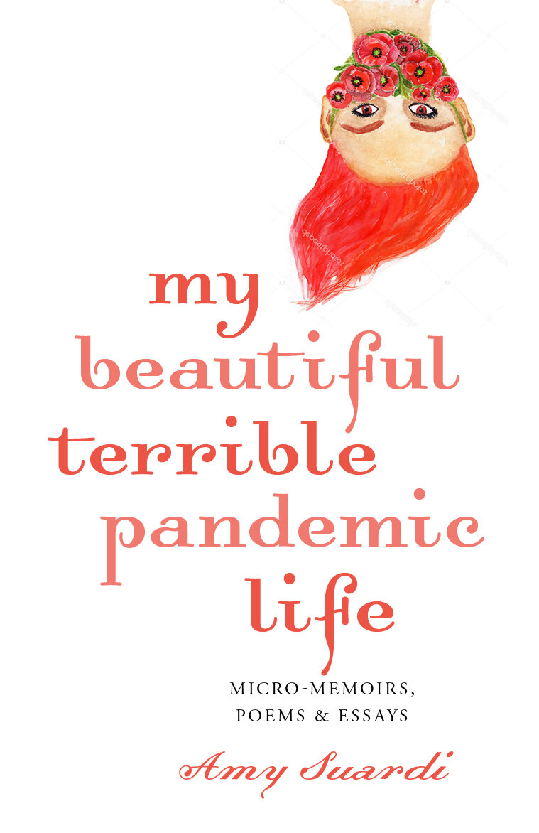
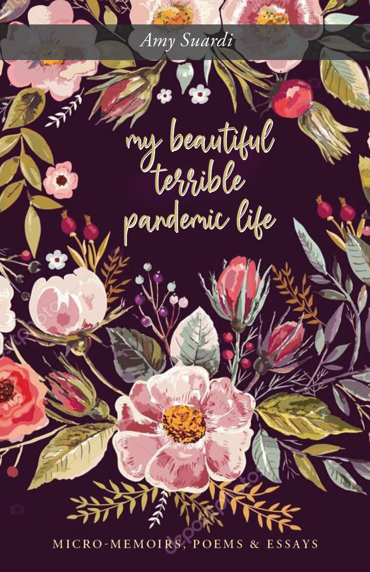
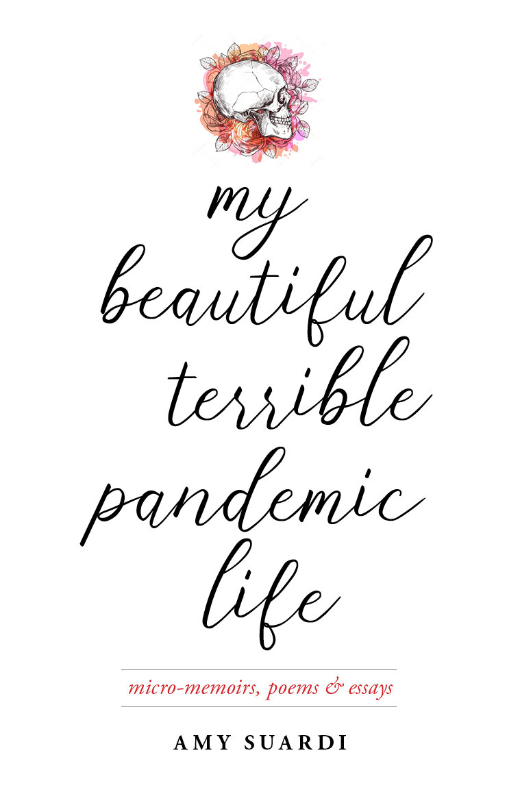
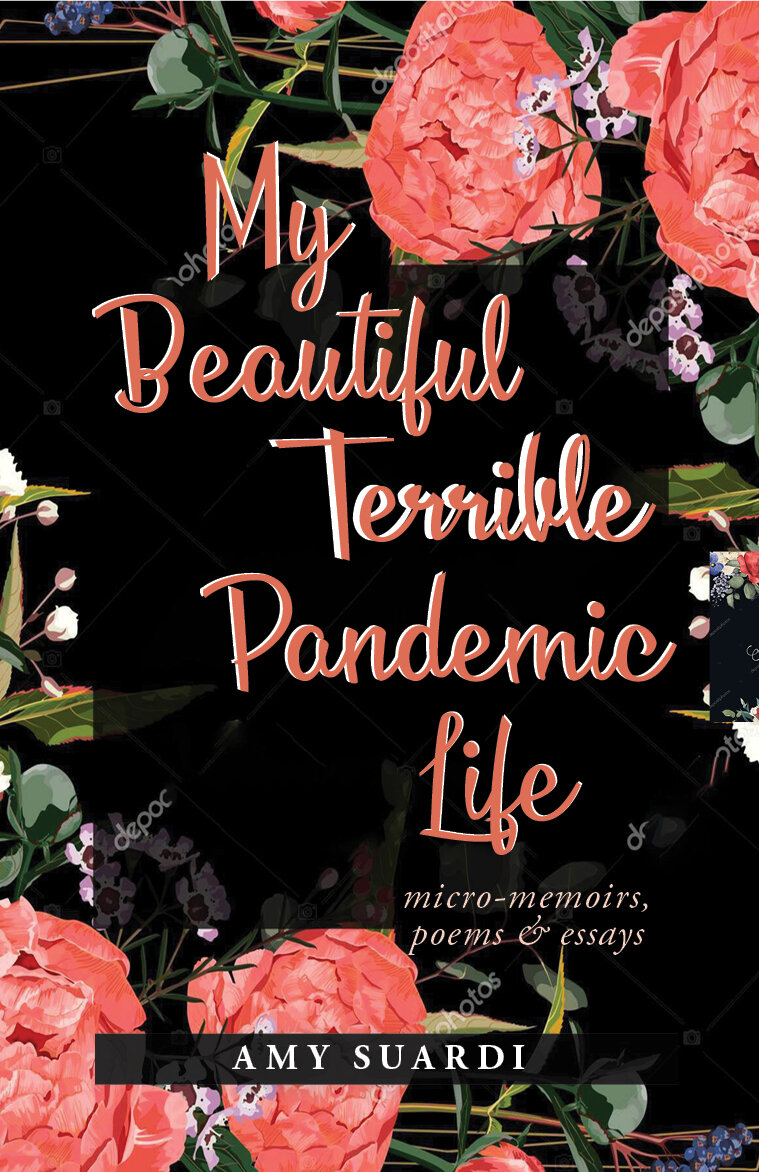
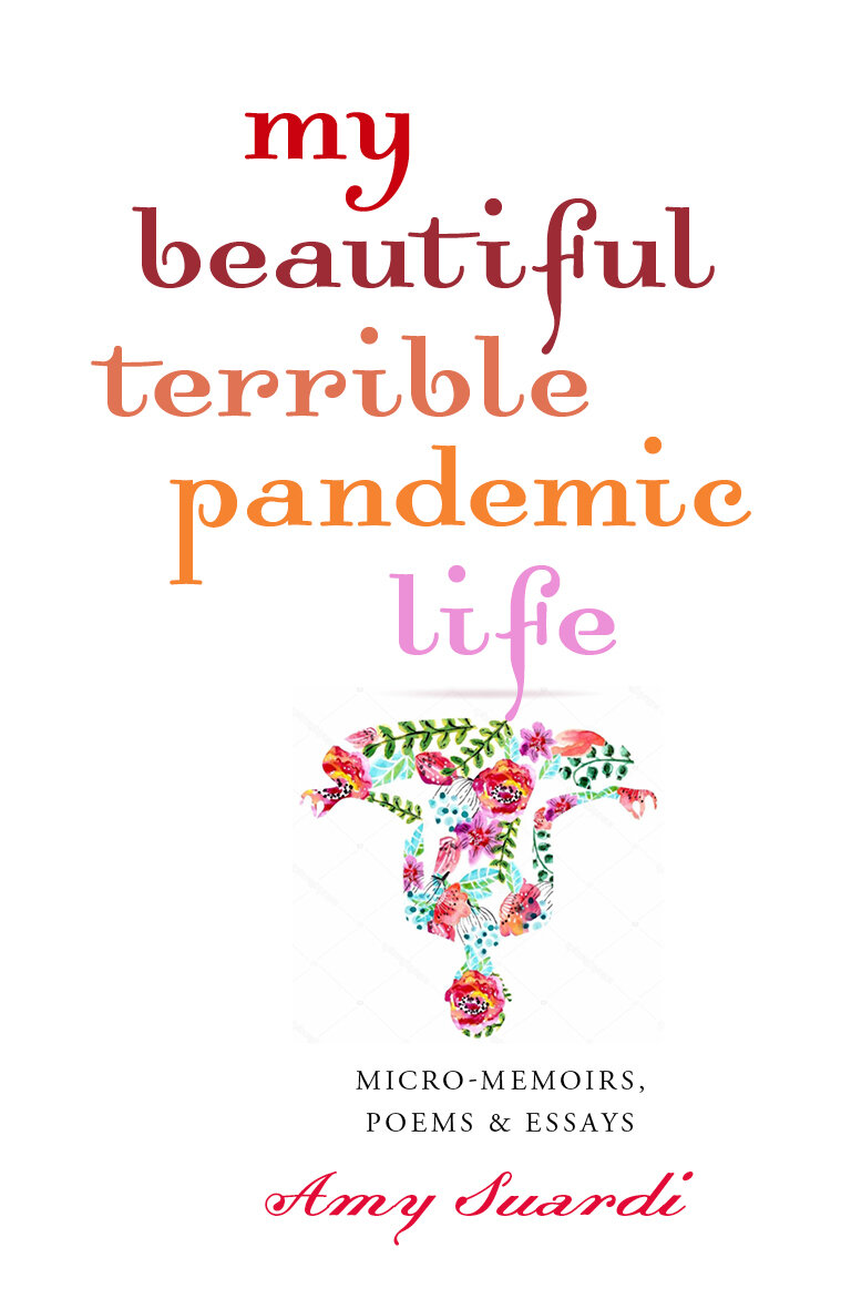

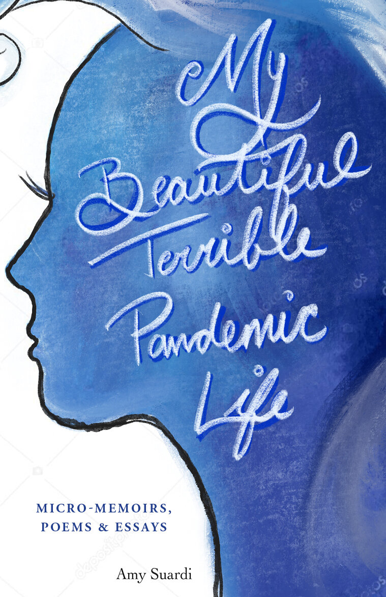
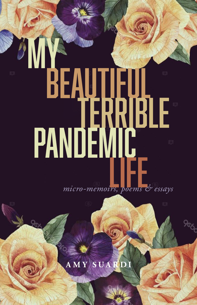

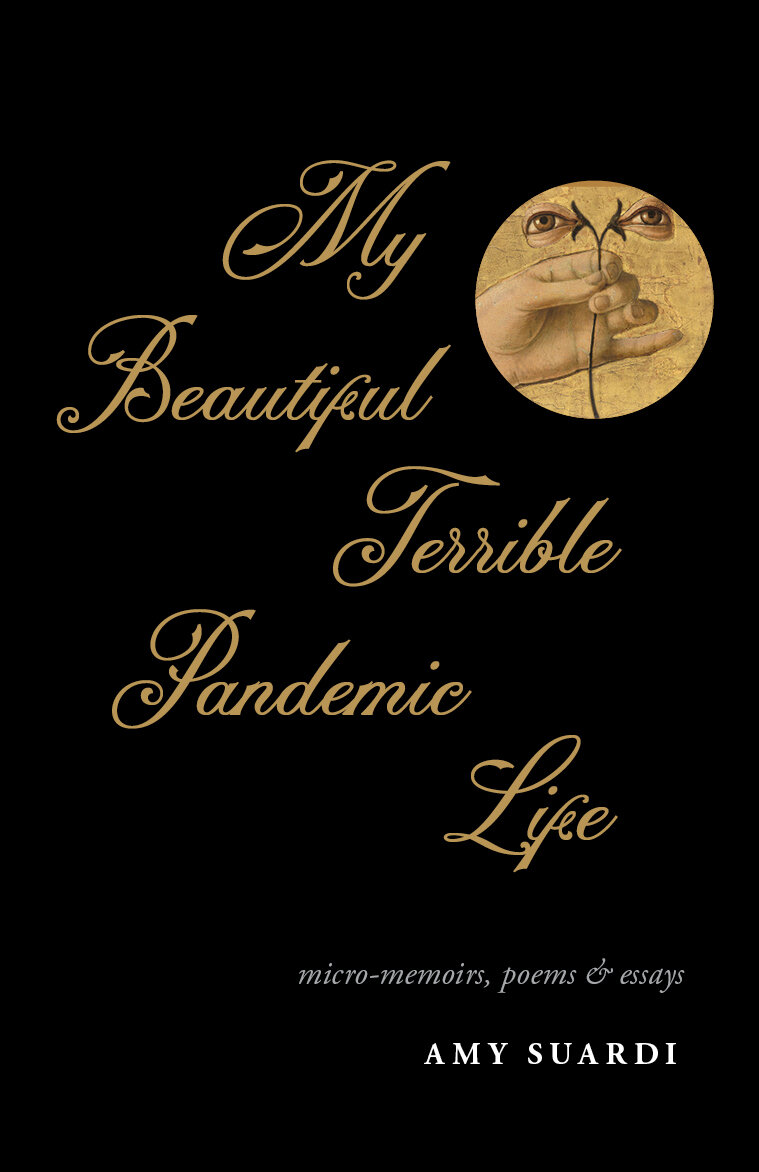
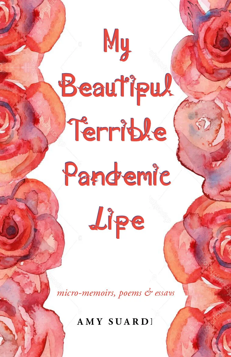
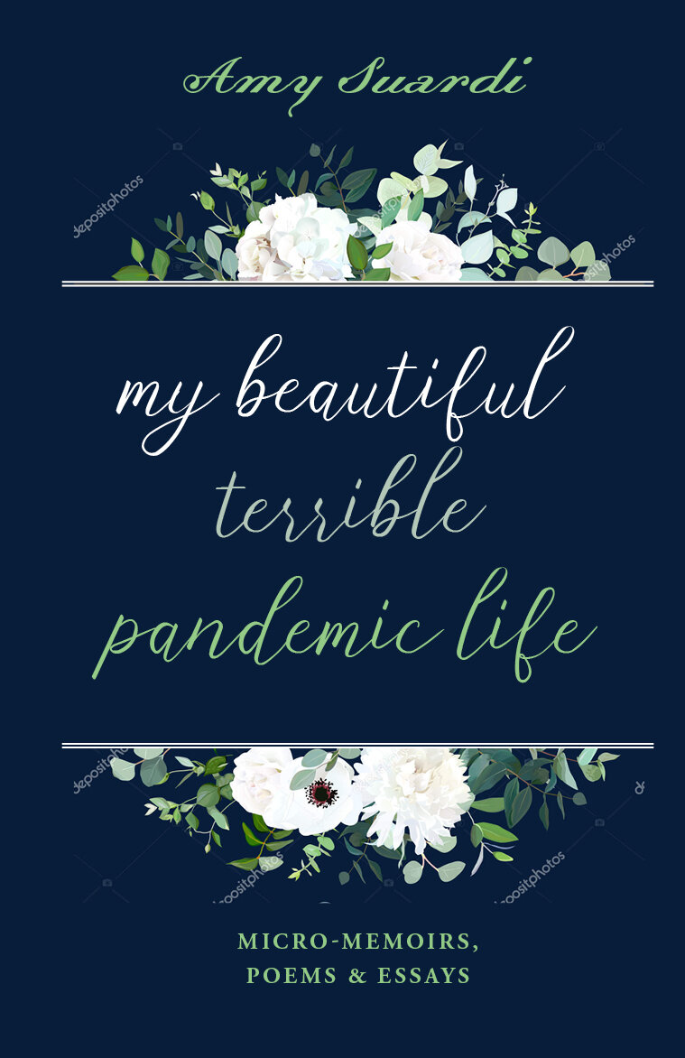


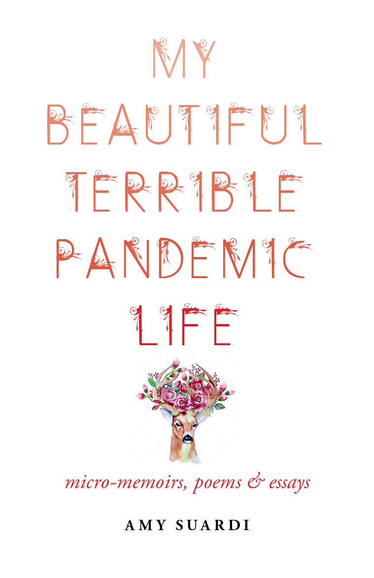
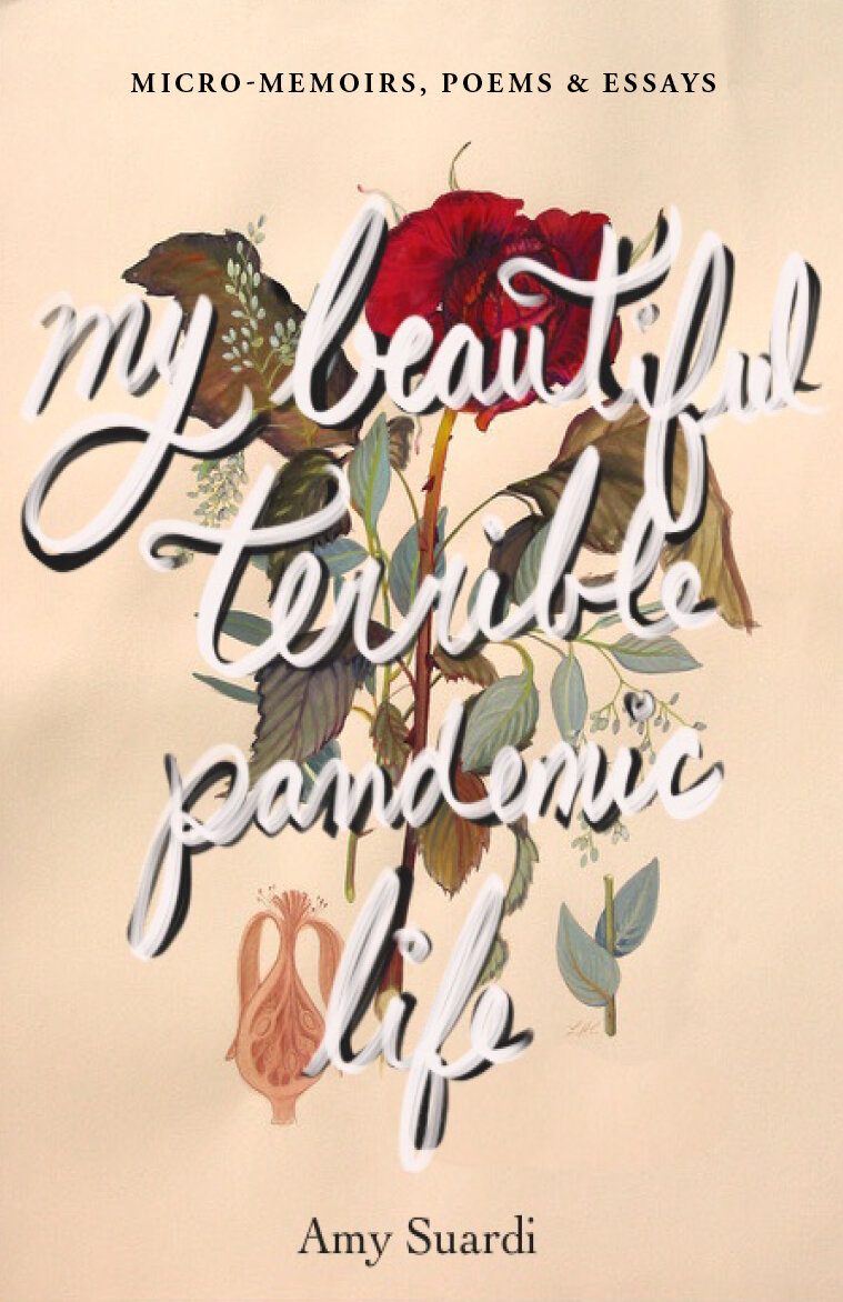
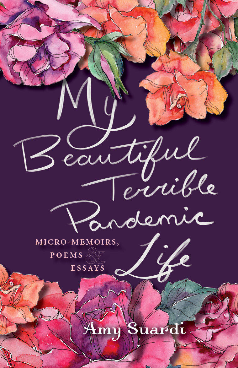
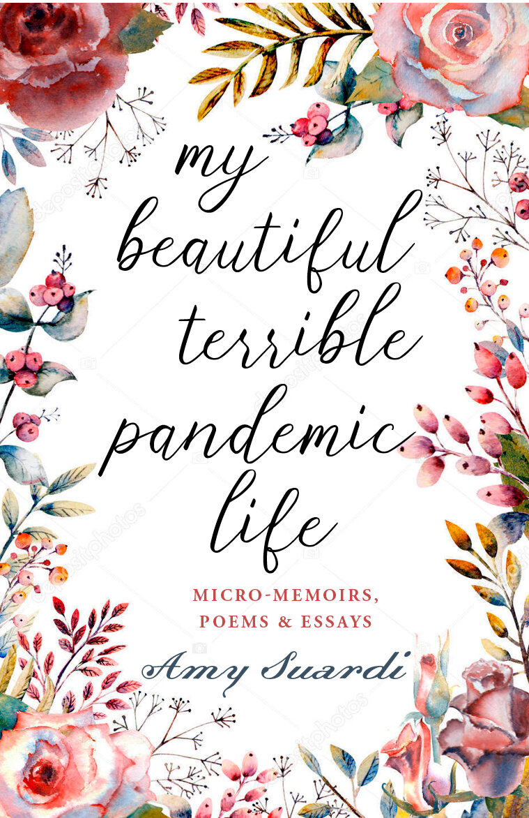
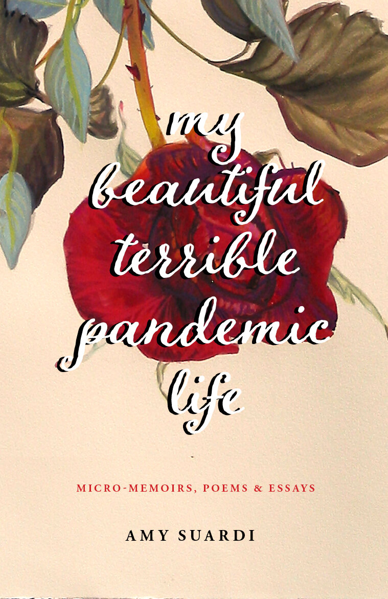
Sketches bu Studio Red Design of possible cover designs for Amy’s book, My Beautiful Terrible Pandemic Life.