Cántaro
Brainstorming possible logo ideas for Cántaro
So, we adore the Farmer to Farmer (F2F) organization! This program helps individuals and their communities – working at the ground level to sustainably improve livelihoods. When asked if we would be willing to virtually volunteer in this time of pandemic, Kevin and I both jumped at the opportunity! F2F is a perfect compliment to our mission of using our design talents in hopes to better our world.
Moreover, now more than ever, small businesses around the world are struggling to stay viable in this time of Covid and need help. F2F is a program under NCBA Clusa, and for this assignment, is partnering with UNDP-Ecuador and Jardin de Azuayo Savings and Credit Co-operative (COACJA). This time, F2F reached out to us to develop a catalog and a logo for a small cooperative jewelry business in Ecuador. Specifically, to help this coop build their individual brand, differentiate them from their neighbors, and make them more competitive in their marketplace.
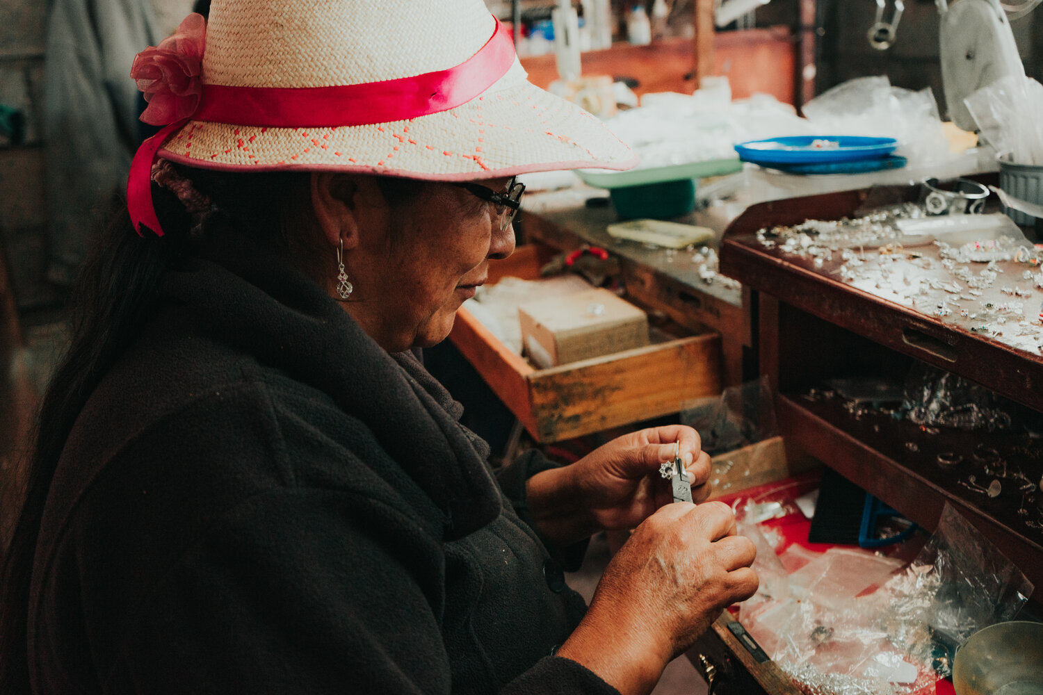
We kicked off the project in August and since then we have been working with a cooperative of jewelry artisans in Chordeleg, Ecuador, Union de Joyeros Chordeleg (coop or cooperative). This region of Ecuador is known for it’s beautiful filigree jewelry (there are more than 71 jewelry shops and 469 registered artisans who manufacture jewelry there). The coop was established in 2017 and currently has 23 members (13 men, who create the jewelry, and 10 women, who lead the sales).
Chordeleg, like most of the world, has been hit hard by the pandemic. Due to severely reduced sales (most sales are ultimately based on tourism) many members have been forced returned to work in the fields. Before the pandemic, the average income per jeweler was $400/month. Most of their clients are middlemen who buy silver jewelry for $1.60/gram, while the sale price for other clients is of $3.00/gram. Each jeweler buys 100-150 grams/week of silver bars. They manufacture earrings, rings, bracelets, and necklaces. Prior to the pandemic, the jewelers manufactured approximately 25 pieces weekly per member, making around 15,000 pieces annually.
I have to say that I deeply missed the opportunity to work directly with these artisans (I have fond memories working with the coop coffee members of Piedras Azueles in the mountains of northern El Salvador), but remain glad that we could use our skills to help others.
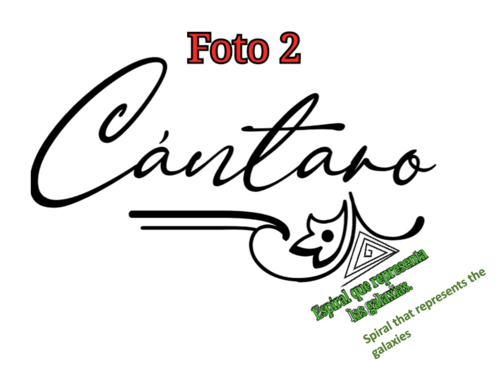
When developing the logo, the jewelers wanted to draw from visual elements of their local Cañari culture. These elements include symbols representing the natural wonders of the Andean Cosmovision, such as Mother Earth (Pachamama), Father Sun, water, stars and humans connection to nature. We used their sketch of the spiraling triangle (represents the galaxies) as inspiration for their logo. These symbols can be found represented in many of their beautiful silver art.
Below are photos of the sketches from our logo development process.
As we came to the close of our project with Cantáro, we were asked to provide “Smart Recommendations.” Their acronym is as follows:
Specific (simple, sensible, significant)
Measurable (meaningful, motivating)
Achievable (agreed, attainable)
Relevant (reasonable, realistic and resourced, results-based)
Time bound (time-based, time limited, time/cost limited, timely, time-sensitive)
For our Smart recommendations, we gave guidance on consistent logo usage (good for all organizations to remember):
Use the new logo consistently to brand all materials associated with your cooperative and its jewelry products.
When using the logo, do not distort or change the logo in anyway.
Do not stretch/distort the logo. Treat it with love and respect.
Do not change the logo’s colors.
Try to use the same paper for all of your printed materials (pick one and stick with it!).
Consistency is key to building a recognizable brand your audience can trust.
In addition to creating a logo for their coop, we created a catalogue design to show their work. Keeping in mind the coop’s resources, Kevin designed a brochure template within Publisher, and worked with them to teach them how to use the structured templates themselves to create their own catalogues as needed. We thought it was important to empower them to be able to create and manage their booklet themselves, and not be tied to a third party.
Catalogs are powerful marketing tools that can entice clients, increase sales and spread the word about products and services. The coop did not have a catalog to showcase their products and did not use social media for commercialization. They needed support on these aspects to be able to commercialize their products through digital platforms and reach other clients beyond their current ones. They would like to reach markets in bigger cities such as Cuenca, Quito and Guayaquil.
Our hope for Cántaro is to be able to sell directly to the end user of their jewelry, reducing their reliance on the middle-men that currently take a big cut of their sales (50% on average). We hope this mark can help bring the group together and drive greater efforts to bring success. We want them to use this mark throughout all of their productions (tags, Instagram, website, displays…),to educate their community and the world about their coop and their beautiful work, and to create a sustainable and thriving business for the members and the local community.